karenamistry.01@gmail.com

Retail Coordination at Meerby

I stepped beyond my branding role to advocate for a more user-centred approach to the product. I led the research and redesign of Meerby's employee coordination tool, creating the foundation for future features and continued growth.

3.4%

Increase in Sales Lift

14%

NPS increase

2 million

requests managed across 34 stores

Timeline

January to April, 2022

Team

1 Designer1 Developer1 Project Lead
Beacons app mockup on a phone
Beacons app store request button in context
Beacons store request button detail
Beacons manager dashboard on a phone
Manager dashboard with live shift charts
Manager dashboard scrolled to department chart
Beacons achievements screen on a phone
Achievements and badge milestones
You've reached Gold milestone celebration
Achievements page scrolled to badges at the bottom

Problem Framing

Nobody had asked the employees what they needed

In 2022, the team had plans to scale Meerby to new retailers. Scaling without first understanding how employees actually used the product meant inheriting the same problems at every new store. This was the moment to fix them before they multiplied.

I stepped beyond my branding role to advocate for a more user-centered approach. Rather than treating this as a technical rollout, I made the case that solving the employee experience first was what would actually let the product scale.

User Research

Proposing research to shape this project and the next

I proposed and led user research before the platform scaled, interviewing over 18 employees, including floor staff and retail managers, at a Canadian Tire store where Meerby was already deployed. These conversations revealed that one experience couldn't serve every employee.

Rather than designing for an average user, I built three personas: the Rookie, the Veteran, and the Supervisor. Their pain points ranged from feeling invisible to struggling with small text on the floor to having no way to act on data during a shift. The research became a reference point for decisions for this project and the next.

Personas

The Rookie

Starting their first retail job and still finding their place among more experienced coworkers. Comfortable picking up new technology and eager to prove themselves.

Experience

Low

Roles

Sales, Fulfillment

Motivation

Build confidence and show that they're contributing to the team.

Pain points

  • •No way to know if they're meeting expectations
  • •Individual effort feels invisible

Needs

  • •Feedback that reinforces progress
  • •Clear expectations and guidance

The Veteran

Years of experience have given them deep knowledge of how the store operates. They rely on familiar processes and can be less comfortable adopting new technology while working.

Experience

High

Roles

Department Lead, Customer Service

Motivation

Help customers efficiently without technology getting in the way.

Pain points

  • •Small text is difficult to read while moving around the floor
  • •Handling requests involves too many steps

Needs

  • •Simple, legible interactions
  • •Fast workflows that respect their existing knowledge

The Supervisor

Responsible for both their own work and the performance of the floor. They have access to store data, but struggle to turn it into something useful during a shift.

Experience

High

Role

Retail Manager

Motivation

Keep the team on track and identify problems before they affect customers.

Pain points

  • •Existing stats don't provide anything actionable during a shift
  • •Feedback gathered from memory is easily lost

Needs

  • •Actionable information, not just reporting
  • •Visibility into team performance and issues

“My effort should be visibile in the app.”

Canadian Tire, Floor Employee

“I need to be confident I'm doing the right thing, especially in front of a customer.”

Canadian Tire, Floor Employee

“I need to make decisions in the moment, not after the fact.”

Canadian Tire, Retail Manager

Synthesis

Employees felt a lack of...

Trust

Responses were often hesitant, delayed, or duplicated.

Visibility

Individual efforts disappeared into store metrics.

Clarity

Requests were shown across multiple views.

Impact

HighLow
LowHigh
Employees can't tell if a request is already being handled

Effort

Employees can't tell if a request is already being handled

Design Challenge #1

Employees assumed someone else would respond and often, nobody did.

When a request came in, employees had no way to know if a coworker was already handling it. The only option was to physically look around the floor, which wasn't always possible in a busy store. That gap in visibility led to either two people responding to the same customer, or nobody responding at all.

Concept Validation

Providing coworker visibility

I hypothesized that the lack of visibility into what their coworkers were handling was the cause of this hesitation, but I needed to validate that before committing to a direction.

I designed two approaches to test my hypothesis. This allowed me to validate my hypothesis and choose the right direction going forward.

Option 1: Adding in progress cards

Option 1: Adding in progress cards

Option 2: Making an in progress tab

Option 2: Making an in progress tab

Feedback Synthesis

Combining visibility with urgency

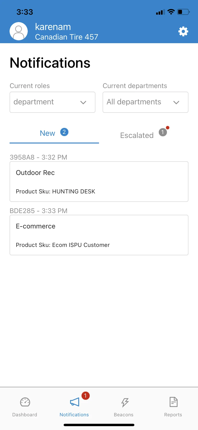
Employees responded well to the new design. They liked elements of both options, so I combined the strongest elements from both. This surfaced that high-priority requests were getting buried in the list, so I reordered the tabs to bring the most urgent ones to the top.

I redesigned the notification to surface coworker status directly on each request card. Employees could see at a glance whether someone was already on it, removing the guesswork and letting them decide with confidence instead of hesitation.

Outcome

Employees responded to requests without hesitation.

Average weekly unresolved requests showed a notable decrease from 9 to 5 in the first 2 weeks, which is a 44% reduction. The visibility gave employees confidence to make faster decisions.

Before

After

Previous notifications screen showing requests without coworker visibility
Final prototype notifications page

Design Challenge #2

Employees were working hard, but the app never showed it.

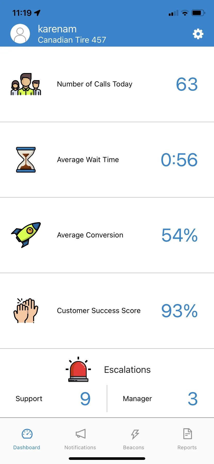
The Dashboard showed the daily stats for requests received, average customer wait time, and a customer success score. These were all numbers reflective only of the store's success. Nothing showed what any individual had done. For employees trying to gauge their own progress, there was nothing to look at.

Research

Analyzing other solutions

Before designing, I looked at how other apps reward and motivate. Running apps like Nike Run Club and Apple Fitness keep users engaged through personal records, streaks, and milestones.

Competitive analysis of achievement badges, streaks, and milestones in fitness and wellness apps

Research

Why personal progress beat leaderboards

Rather than comparing employees against one another, I decided to reward personal progress because research showed it creates longer lasting motivation. Leaderboards can work for a short period, but fail in the long term because they leave people feeling inadequate. Individual progress tracking works because it is about competing with yourself, not others.

Store leaderboard ranked by CXP points

Leaderboards

Creates a lasting feeling of inadequacy

Outcome

Progress over time became something employees could see in the app.

Employees could finally see the impact of their work, motivating them through personal progress instead of competition. When employees hit milestones, they earn badges to provide a sense of levelling up individually, without competing against coworkers.

Before

After

Previous dashboard showing only store-wide metrics
Final prototype achievements page

Design Challenge #3

Managers needed to export data to get request insights.

During a shift, managers made staffing calls based on experience. Any real analysis of what happened came later, once the moment that mattered was already over.

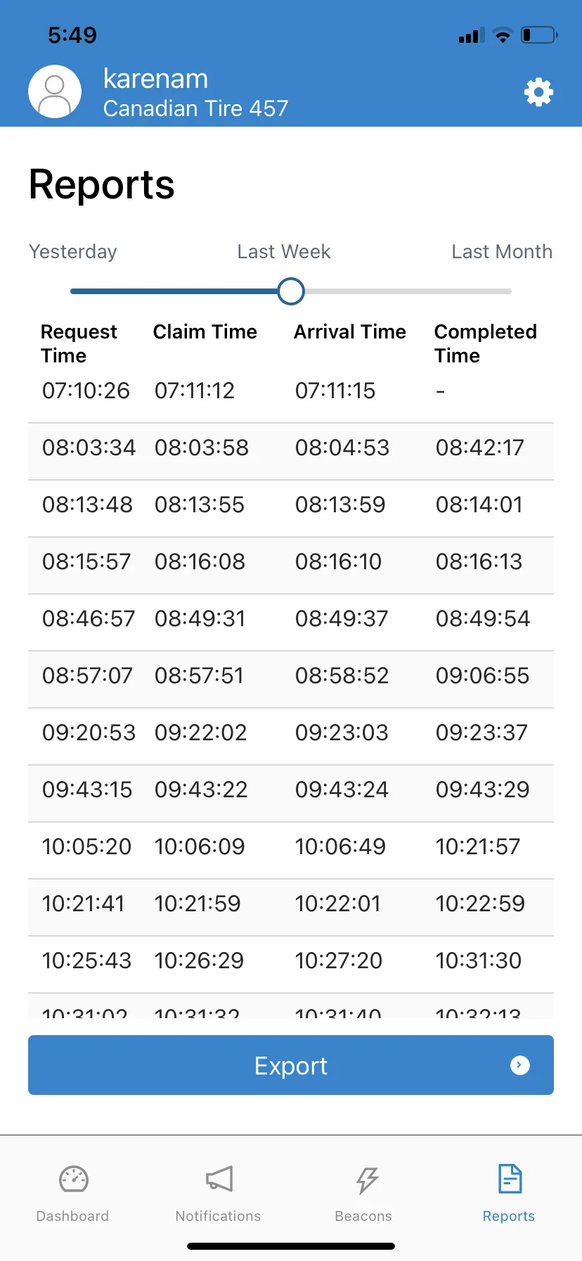
Previous workflow

Parsing Excel Sheets

All requests were logged in a table, showing managers when a request came in, when it was claimed, when someone arrived, and when it was finished. To find any pattern, managers had to export this data and import it into Excel for analysis because there was no way of seeing that during a live shift.

Iteration Process

Refining the charts

Managers could find insights in two places: the Dashboard tab and the Reports tab. The dashboard showed daily statistics, while the reports showed historical statistics. Merging the two would create a single view for the request data.

Managers needed visibility into how their sales floor was responding to requests during a shift. Live charts provided that visibility. I prioritized clarity over complexity, while still keeping the data available for export. For example, charts showing requests by day of the week were replaced with charts showing requests by time of day.

Initial Iteration

Popularity by day of week

Day of week only confirmed what managers already knew, Saturdays are busy.

Final Design

Popularity by time of day

On time72%
Late28%

Time of day revealed the staffing gaps that actually mattered, like the 5pm rush.

Outcome

Managers could catch a problem while it was still happening.

Managers could finally see problems as they formed instead of after the fact. Live visibility into request volume by hour meant a busy stretch could be caught while it was building, not read about 2 days later in a spreadsheet. Seeing where requests concentrated by department meant staffing decisions could respond to what was actually happening on the floor, in real time. Excel export was no longer the only path to insight.

Before

After

Previous reports screen showing request data in a table
Final prototype manager dashboard

Impact

My redesign became the foundation on which Meerby was built. The employee-centred interface created the infrastructure for their dispatch system to scale across hundreds of stores.

It shipped because the work was grounded in what employees actually needed. These were real solutions based on what employees told me, and not just features their competitors had.

Reflections

Working in a high-stakes context, where employees are making decisions under pressure, made it clear that the experience needed to come first. It was shaped by the environment, mental load, and trust. I prioritized the experience and then focused on getting the interface right.

It also reinforced that designing with real users improved the decision quality. It was encouraging to get positive feedback from people who actually used the product.

Designing for both the employee and the business made me a better systems thinker. There were retail systems that I needed to learn and understand to make proper decisions when designing.