Data Security at Superna
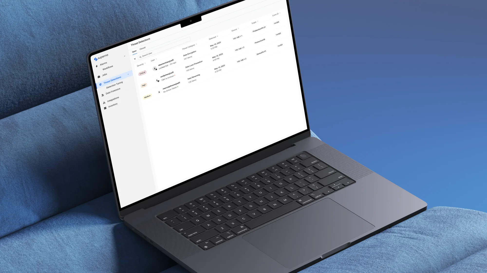
I led the redesign of our flagship product, Data Security Edition, owning research and design while partnering closely with designers, product managers and engineers. The redesign became a key differentiator in competitive deals, supporting customer retention and future growth.
1.6 hrs
per day given back to security teams
57%
reduction in false positive investigation time
92%
reduction in time to comprehend a threat
Timeline
April 2023 to February 2026
Team
Problem Framing
Security teams had no clear picture
In 2023, our sales team kept hearing the same feedback: the interface felt dated, and existing customers were missing critical threats due to interface friction. If this continued, we risked losing our position as a leader in enterprise data security for unstructured data. I worked with our PMs to define what success would look like, and we determined that customers wanted faster comprehension and fewer missed threats.
What started as an interface problem was something deeper. Users had all the information available to them, but they couldn't see how it fit together. There was a gap in comprehension which made the product feel dated and untrustworthy.
User Research
Understanding how teams investigated threats
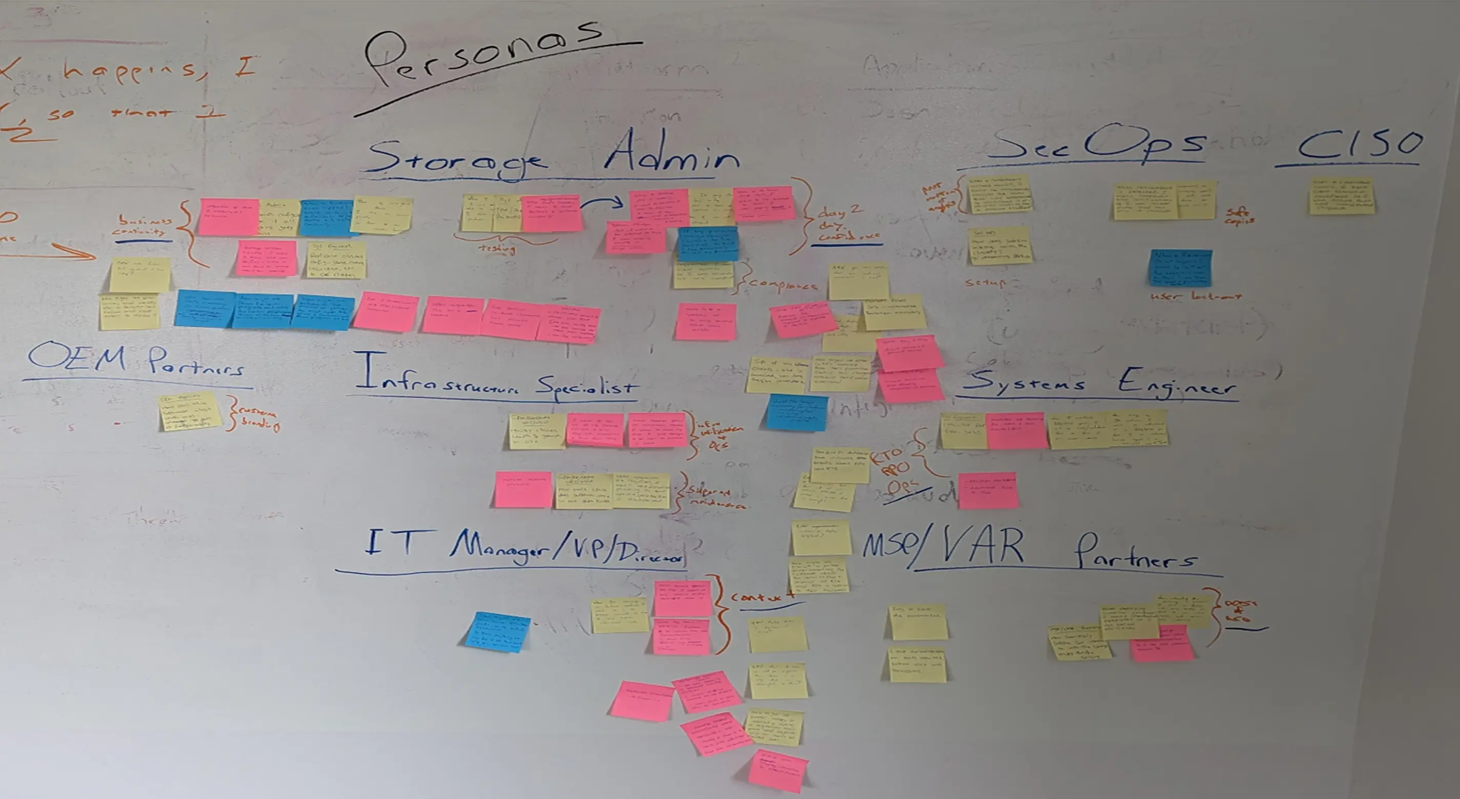
I worked with PMs to interview storage administrators and IT managers, understanding how they investigated threats, made decisions under pressure, and handed work across teams. From cross-functional workshops, I synthesized findings into personas, journey maps, and affinity diagrams that aligned the team around where the investigation experience was breaking down.
Systems Thinking
Mapping every second in an investigation
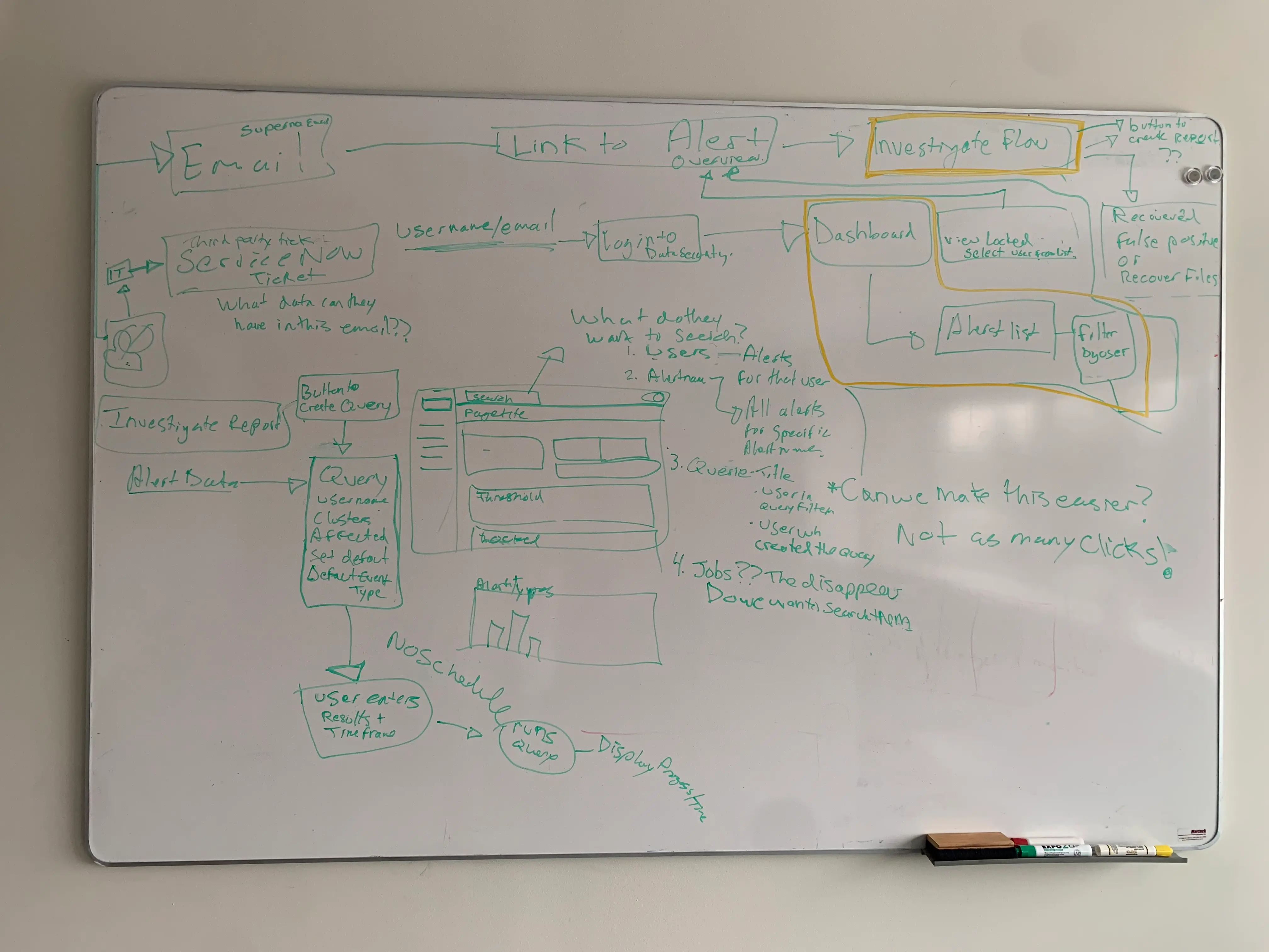
I mapped the full path a security team takes when investigating a threat, based on interviews with real storage admins and security analysts. The map showed the shift in mindset between scanning for alerts, investigating a specific threat, and recovering from it, along with the exact points where teammates needed to handoff or collaborate.
Interviews also showed this process looked different depending on team size and role. I built personas for roles like Storage Admin, Security Analyst, and Chief Information Officer to understand how their capabilities and responsibilities differed. Designing for this system meant accounting for both a storage administrator working alone and a full security team collaborating on the same investigation.
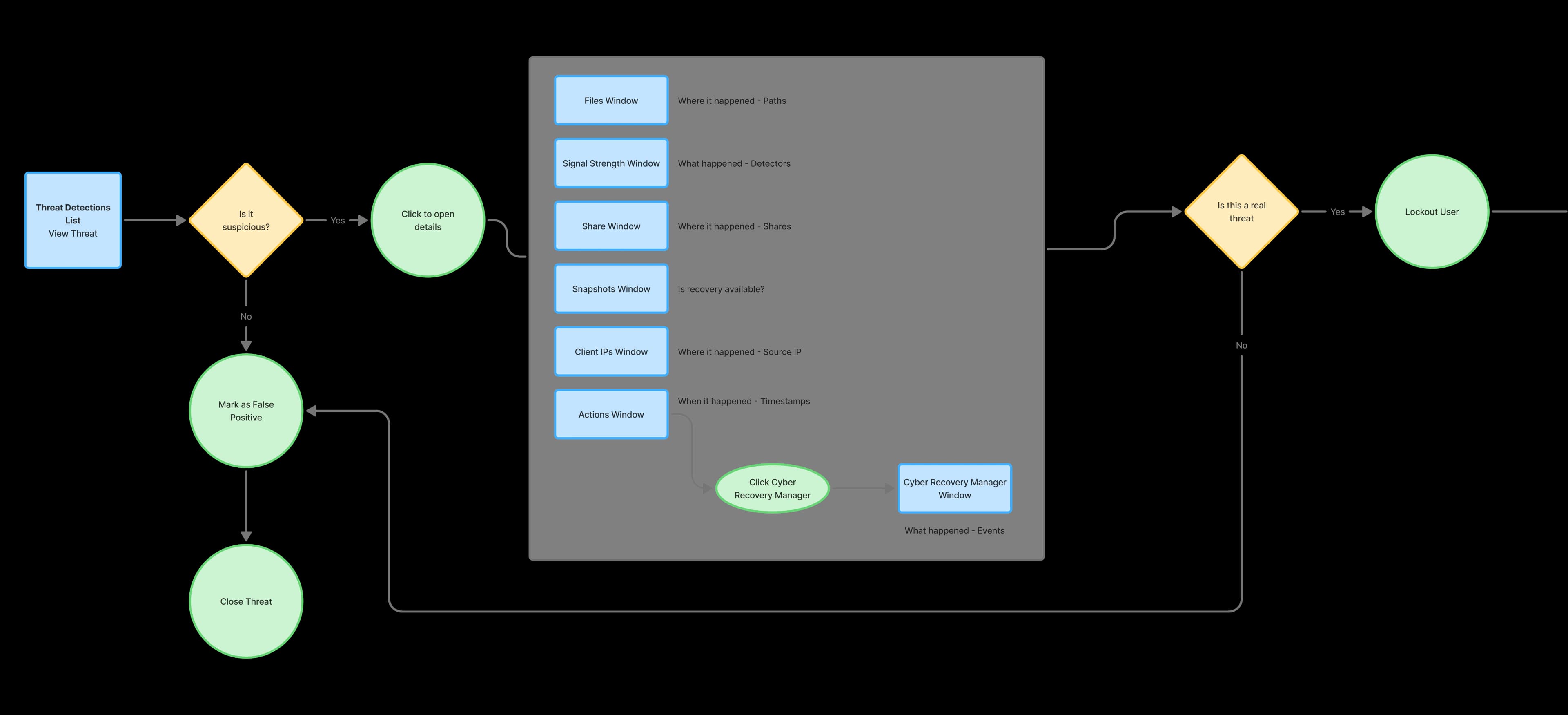
High Level Threat Workflow
This is a simplified version of the system with details removed
Synthesis
Research revealed four sources of friction
The research surfaced four consistent themes: the interface felt dated, disorienting, disconnected, and overwhelming. Users switched between too many windows, pieced together a single threat across multiple views, and carried a mental load that pulled attention away from higher-risk work.
Dated
The visual design looked dated and reduced trust in the product capabilities.
Disorienting
Recovery and investigation work required switching between too many windows.
Disconnected
Users had to piece together information about a single threat across multiple windows.
Overwhelming
High mental load reduced attention available for higher-risk threats.
Design Challenge #1
Investigating a single threat meant juggling 7 windows at once.
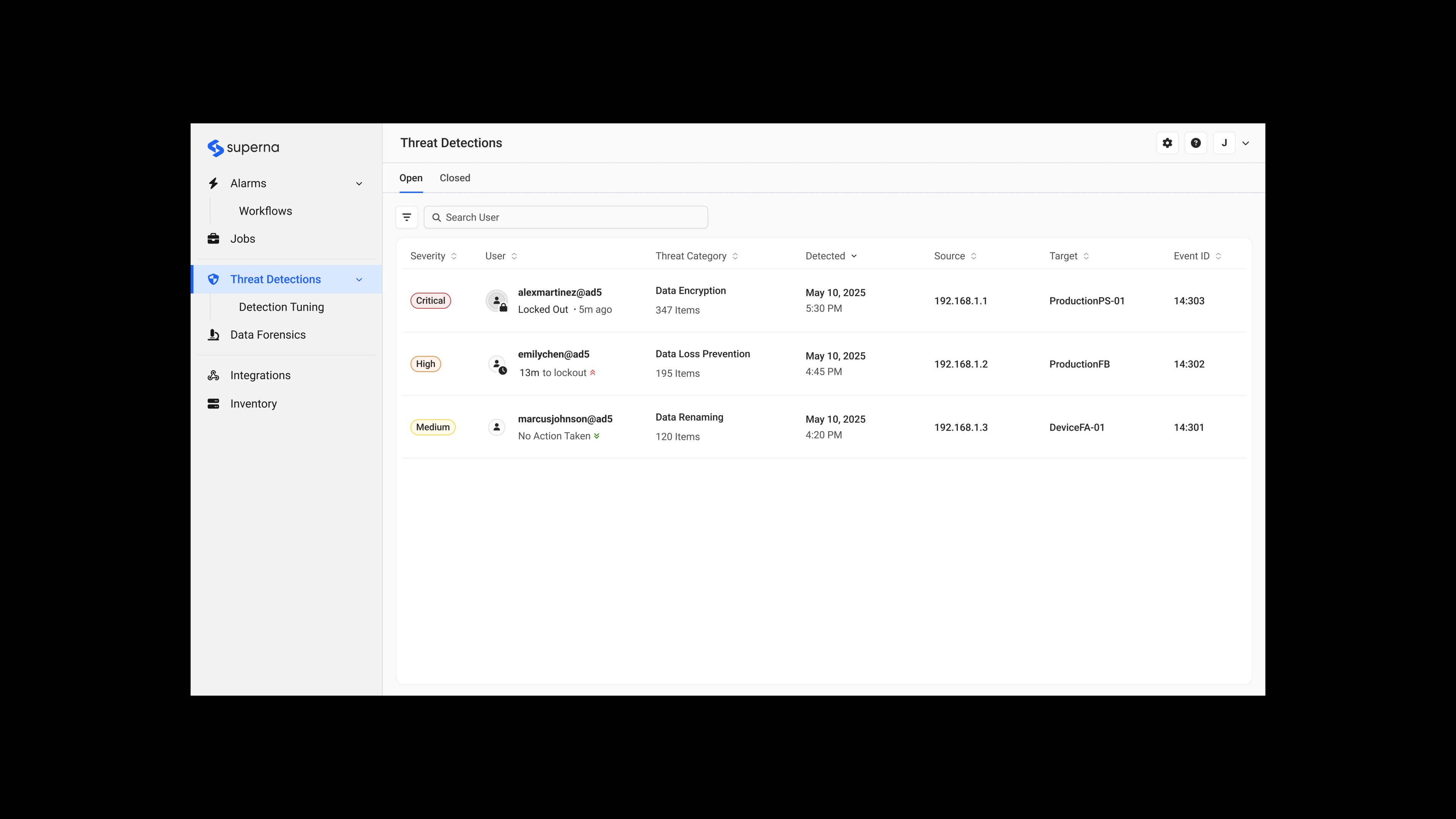
The previous interface scattered threat information across 7 different windows. Users had to click through multiple layers and mentally piece together the story.
First Iteration
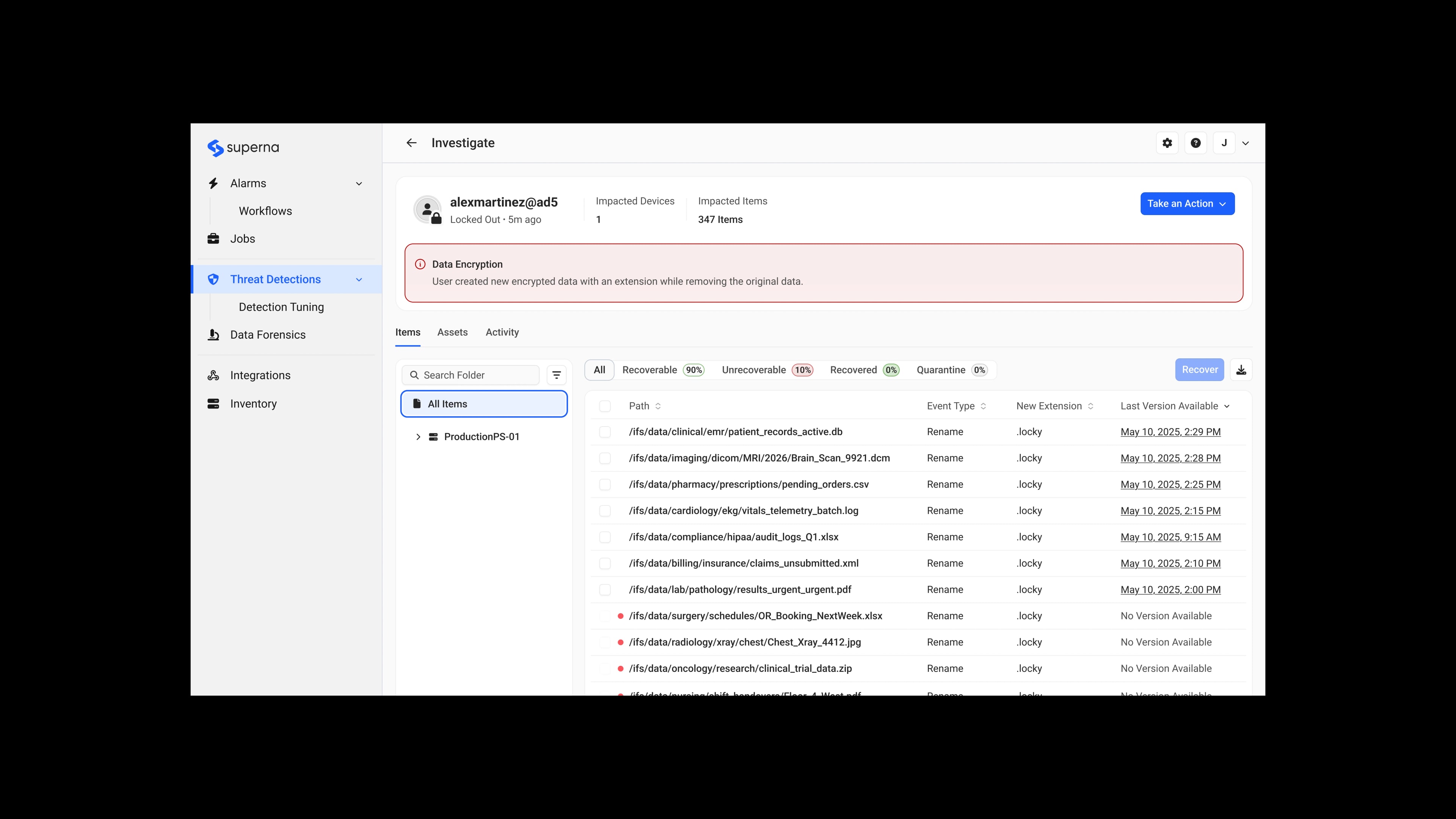
Consolidating Information
Security teams responded positively, but revealed new problems:
Feedback
- “What's the recommended workflow?”
- “Recovery manager gives me the most details when investigating.”
- “I almost missed that there were no snapshots available. That's the first thing I need to know.”
Second Iteration
Reducing Noise
Security teams provided more feedback to further improve the design:
Feedback
- “This is more organized, but I'm seeing details I don't need unless I'm doing a deep investigation.”
- “The rest is not required until I decide to dig in.”
Synthesis
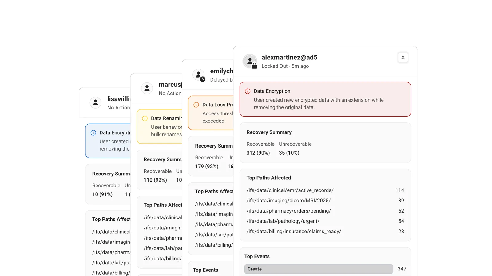
Creating a slide-out pattern for surfacing contextual information.
Users didn't want to fully commit to the details page for something that will most likely not be a threat. This led to the slide-out panel pattern. A middle step between a quick glance and a full investigation. Users could preview key information and only dig deeper when something looked suspicious.
Outcome
Reducing false positive investigation time by 57%
Users could rule out non-threats from the slide-out, so most requests didn't need a full investigation. The new consolidated layout and ability to act right from the slide-out view cut false positive investigation time by 57%. The pattern was adopted by other teams for contexts like the Alarms and Licensing pages.
Before
After
Design Challenge #2
Users did not understand why a threat was flagged as abnormal.
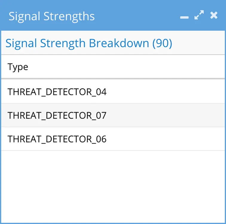
We used cryptic labels, like Threat_Detector_07, to tell users why we flagged behaviour as abnormal. Users had to make an educated guess as to what happened.
Proposed Solution
Simplifying language
The simplest fix was to replace the cryptic labels with plain-language descriptions of what each detector caught.
Before
Improved
Stakeholder Concern

“Describing each detector could give competitors an idea of how to replicate our system.”
User Advocacy
Using research to advocate for clearer language
From many customer conversations, I learned that these labels were either ignored entirely or only understood by long-time users who had memorized them through experience. I used those research findings to build alignment across teams and replace the cryptic detector labels with plain-language descriptions.
Outcome
Cut the time to understand a
threat by 92%.
Users had the context they needed to understand a threat without digging for it. This saved users at least 4 minutes when investigating every threat. It removed a hidden barrier, because they no longer had to memorize internal labels.
Design Challenge #3
Our Figma prototypes couldn't keep up with our product's complexity.
Tasks like file browsing and threat investigation required realistic interactions that Figma prototypes couldn't recreate. We were also maintaining three separate prototypes for three different audiences. That became unsustainable for a two-person design team.
AI Prototyping
Using AI to prototype realistic product workflows
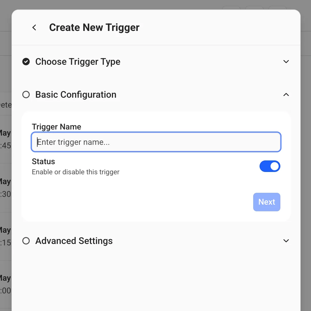
To solve this, I changed our prototyping workflow with the help of AI. I started on my own, treating it as an experiment, turning Figma screens into functioning code. This allowed me to research the best approach before involving the team.
I rebuilt our front end in React and styled prebuilt components using Tailwind CSS to match our existing product implementations. After validating the approach, I brought it to my team, and we opened a shared repository to continue iterating on the approach.
Prototype Library
Creating bespoke tools for the team
I created a versioning feature that allowed us to use the prototype to serve different audiences. A single prototype could show three different states of the product:
Now
Used with developers to show how a feature should look and behave in production.
Next
Shared during customer calls for UAT and beta feedback on upcoming features.
Future
Used in strategic discussions to show where the product was heading.



Future Exploration
Experimental features
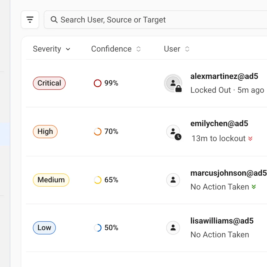
I tested high-fidelity concepts for new features with customers. Customers began asking much more specific questions than what I got in Figma demos. I could put different directions in front of users and get meaningful feedback.
Outcome
We got better, more meaningful feedback from our AI prototypes.
Prototypes felt closer to the real product, and the feedback I got from them was better and more actionable. Customers could respond to workflows that felt real, giving us earlier and more actionable feedback. This meant we could test upcoming and experimental features with fewer rounds of validation.
Design Challenge #4
Building a flexible design system with Dell
We needed to modernize while meeting strict Dell partnership requirements. Rather than maintaining two separate design languages, the design team collaborated with Dell's design team to create one interface supporting both brands with minimal changes.
Documenting Patterns
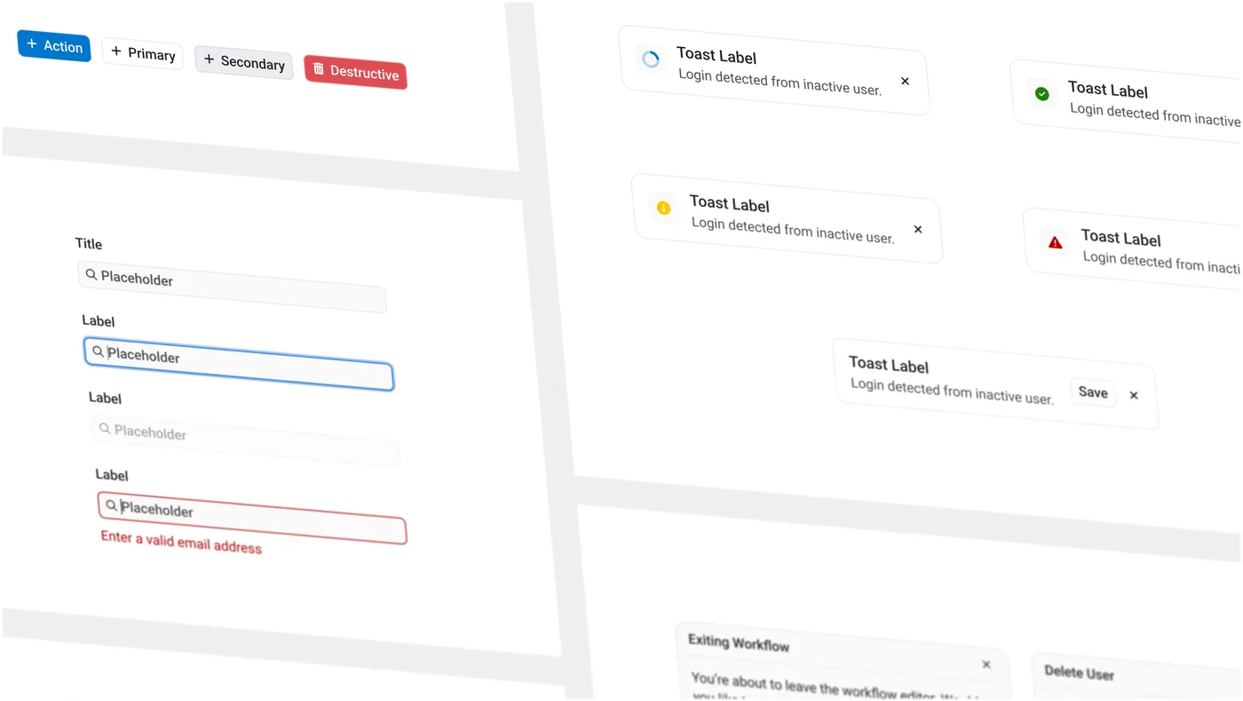
Hyperion design system
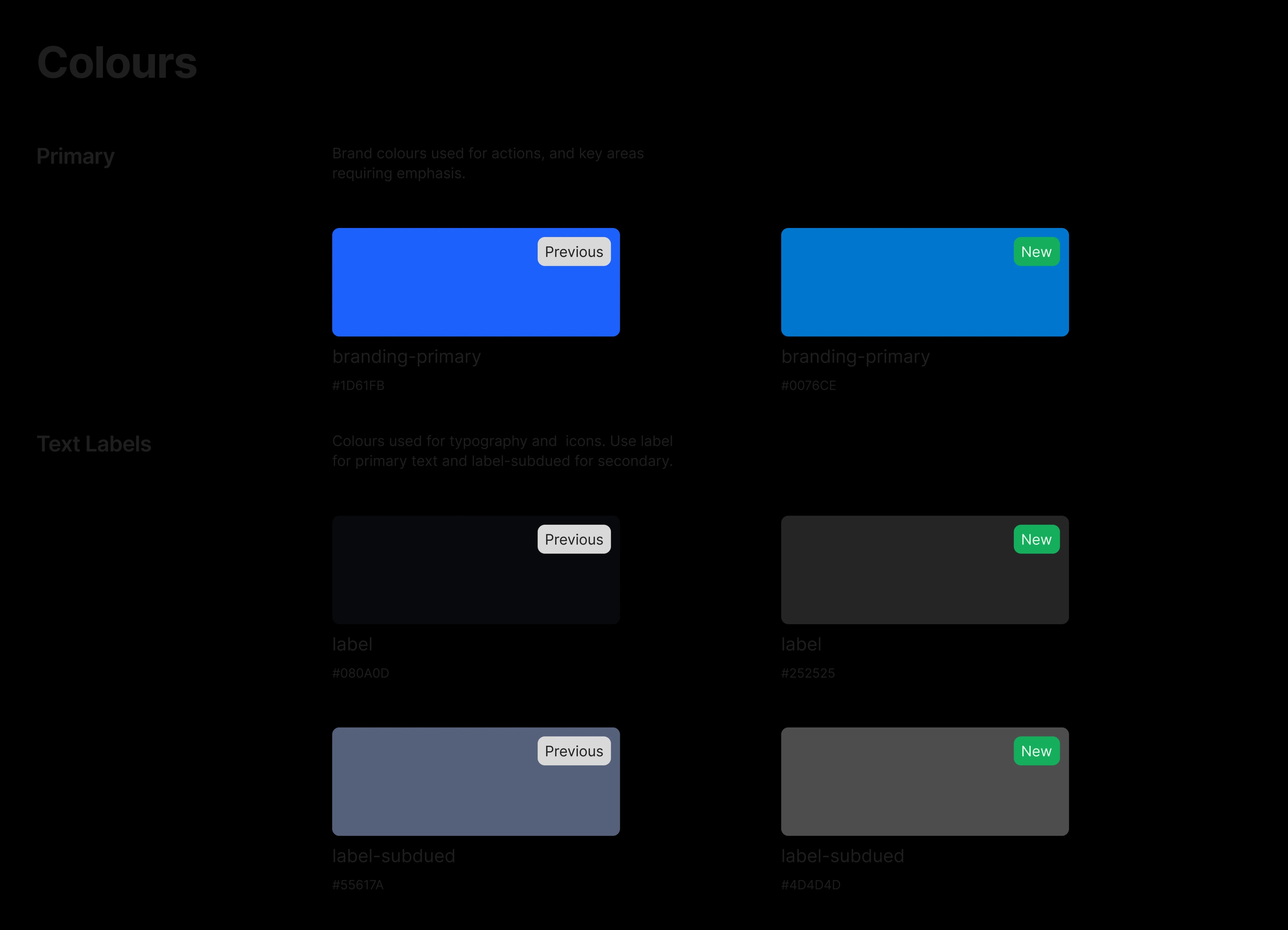
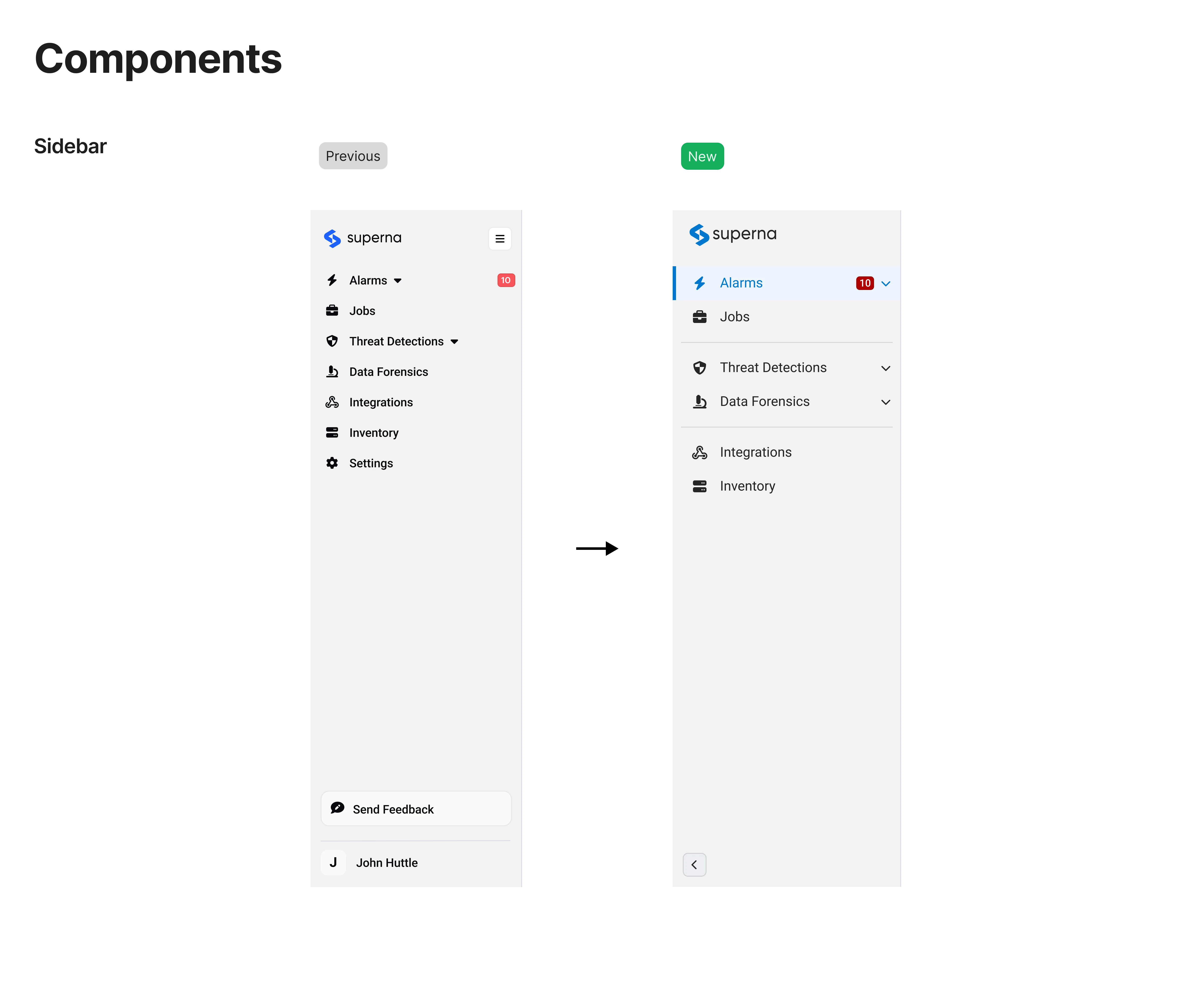
I documented core components like buttons, dropdowns, and slide-out panels as system patterns that could flex between Superna and Dell's brand requirements. Each component and colour was built once and designed to work for both.
The Collaboration
Reviewing the system with Dell
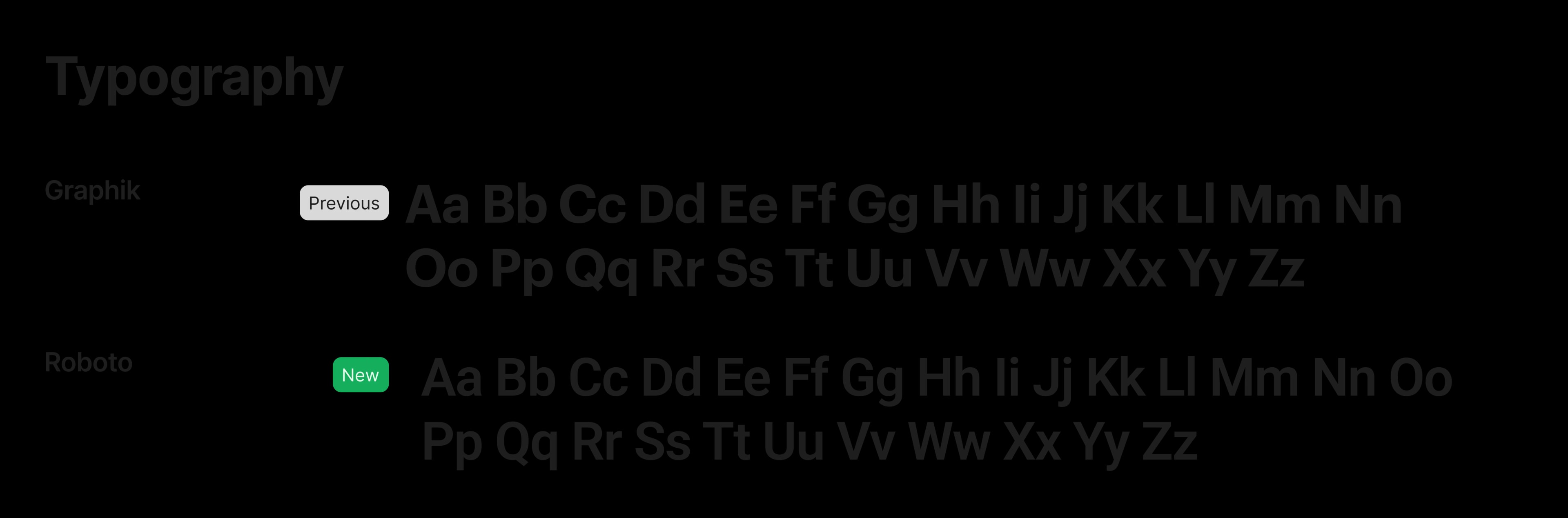
Dell's team joined us in calls to review components, layout, typography, colour, and dark and light mode variations. This was an iterative process to arrive at a system that met both needs.
Outcome
One system modernized the product while preserving the Dell partnership.
The modernized look gave the product a visual our customers felt had been missing, but more importantly, it instilled trust in our product that was previously missing.
Impact
The redesign became a key factor in customer retention and a differentiator in competitive deals. Security teams saw significant reductions in time spent investigating threats.
It shipped because the team was quick and scrappy when it came to designing, validating with users, and making trade-offs when necessary. I balanced design quality with engineering and business constraints.
Reflections
The AI prototyping process changed how I think about the space between design, engineering and product management. Getting concepts into code earlier made all of our processes faster. When I started at Superna, we utilized the Double Diamond approach and after AI was integrated into our processes, we fundamentally changed how we validated ideas. This is an area that I’m still understanding and exploring.
Working within a two-person design team on a complex platform improved my ability to prioritize. I learned to move fast through iterations rather than always waiting for the perfect design.